If you’re designing a brochure, you have one great responsibility in your hands because the company or organization relies on your expertise to help them get their business the leads they need to survive or flourish. If you’re not yet that sure what makes a brochure effective, here are seven elements that should be present in your brochure design:
APPROPRIATE FORMAT
This is the very first step you’ll have to take when creating a brochure. You will usually discuss this with your client, so try to recommend the right medium for the message and type of product your client has to get across.
For example, a tri-fold or z-fold brochure will not be the best choice for luxury products that require lots of white space and big pictures. You will chose one of these narrow formats when you want to present documents that are easy to hand out.
Of course, it is better if you get creative with the format of your brochure. Nowadays many concert organizers create brochures that unfold into a poster. It makes it easy to send by mail, and practical to hang somewhere in the room to make sure the brochure stays visible all the time. The better looking the poster, the more people will hang it, so be artistic if you create this kind of poster.
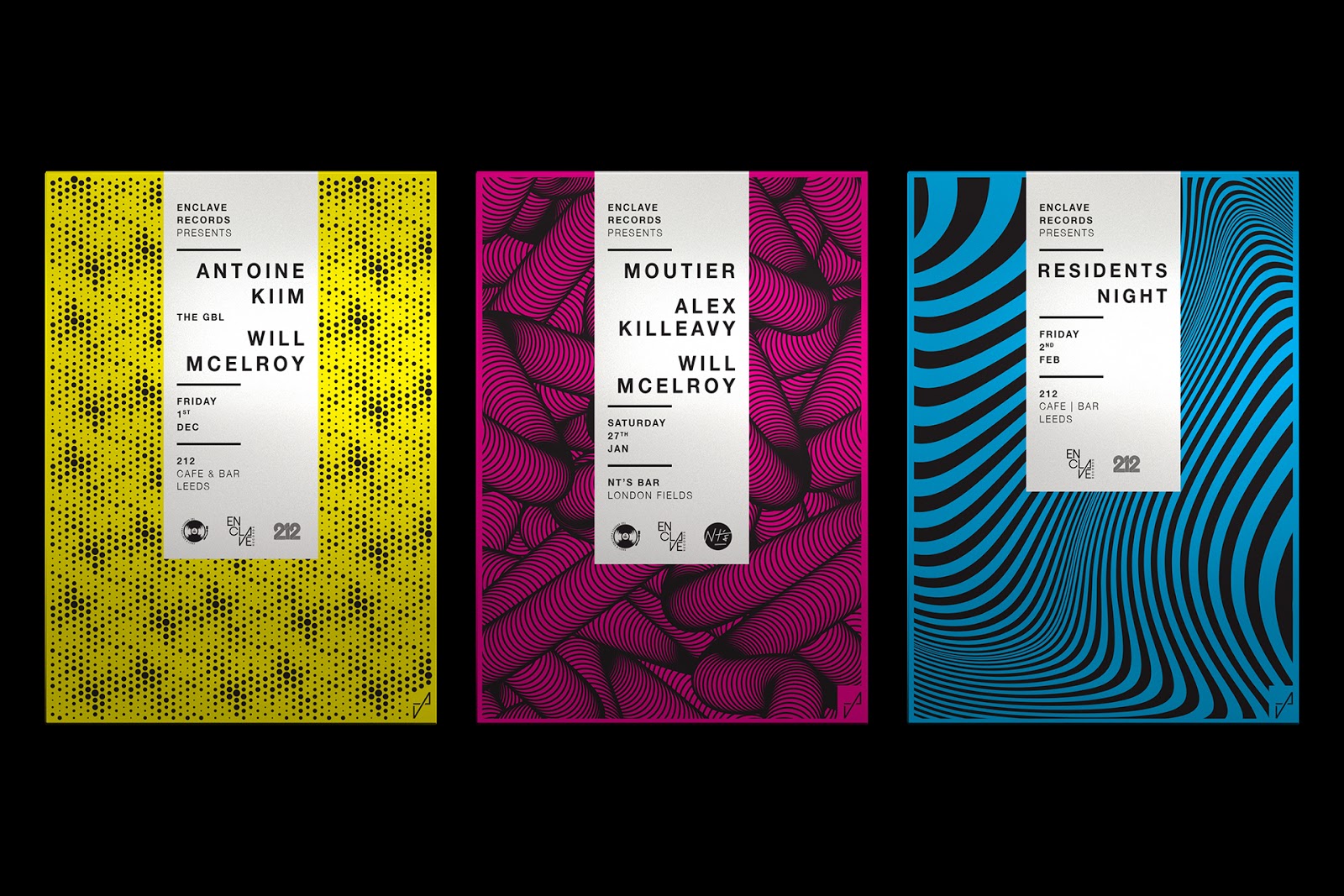
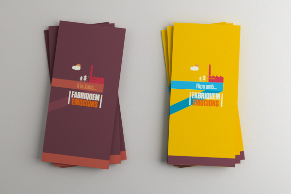
AWESOME COVER DESIGN
The cover is probably the most important part of brochure printing. Use one eye-catching image, the company’s logo, and one phrase that makes people interested in finding out more. Your phrase should be in large type, readable, and not more than ten words. Put this phrase at the top of the brochure so people can see it in a brochure stand.
COLORS THAT SET THE MOOD
When brochure printing, the color scheme should set the mood of your message. If you want to seem fun and playful, choose bright colors. If you want to seem more serious, use more neutral tones.
WHITE SPACE
This may sound like dull advice, because it could be given for any kind of graphic design project, not only for brochure design. It is however important to remember to keep some well-balanced white space on your brochure for the sake of aesthetics and readability.
White space is empty space that gives the reader’s eyes a place to rest. Use plenty of white space to keep your brochure from looking overwhelming. Also use white space to organize different sections of the brochure. Surround quotes and short bits of information that you want people to especially notice with white space as well.
FONTS
Choose fonts that are easy to read and that fit the personality of your business and the brochure’s message. Use different sizes of fonts to help readers know what elements of the brochure are most important. Put the most important information in headings and sub-heads in the largest font size. Then go down from there.
USE THE RIGHT PAPER
Paper is amazing. It can turn a boring design into something great. Try to convince your client to put some money on his brochure’s paper, because it’s well worth it. Make sure that you get some samples to show your client, you must see and touch the paper to know whether you like it or not.
BOXES
Use boxes around different sections of text to help organize the information and draw attention to important text. Avoid using too many or the brochure will look cluttered and no particular thing will stand out.
COMPELLING PHOTOS
Use photographs and images that help the reader to understand your brochure and that show your business helping people. It is best to use two to four pictures when brochure printing or the brochure will seem too busy.
These tips are taken from Printplace and Designer Daily.
____________________________________________
Unified Manufacturing is an L.A. -based one-stop-shop that offers very affordable CD/DVD/USB replication, custom printing, promotional products, warehousing and fulfillment and much more. If you need an Instant Quote on a project and you want FREE SHIPPING, simply CLICK HERE.