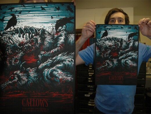
I saw some of his works online and I told myself I have to interview this guy! I simply must! At such a young age, he has already found and established his own style(scroll down to the bottom of the page to check his works).When you see his works, you see something common in all of them even if they’re all still unique from each other. It’s like he stamped all of them with his signature. Well yes, I’ve see some works that are similar to his style but he does it so much better and when you look at his creations, you know that it’s done by Dan Mumford.
Dan Mumford is a 25-year-old freelance CD and Merch designer living in Central London. He’s into sci-fi and horror films from the 80s and 90s and he claims that he’s quite a big nerd. How did you get into design? Did you have a formal schooling? Yeah I did the usual gcse at Camberwell, a level art route and then went into a degree in illustration at Brighton University. What and who are your influences? A lot of sci-fi and horror films and comics from the 80s and 90s are primarily what I love. The kind of imagery I create mostly stems from them. Actually, I don’t tend to look for influence in the graphic design world that much. I do take a lot more influence from other forms of art like film, music, comics, etc. How do you usually work on a concept? I play round with a few ideas then I try to come up with rough sketch idea that has everything I want in it. Could you feature one work and tell us how you did it, the difficulties you encountered, etc? The Evil 9 Zombie landscape piece was a hard one. The main landscape piece spanned over the covers of three 12″ singles, so the artwork had to be made at quite a large scale in the first place and then the actual imagery was comprised of over 20 figures in close detail and about 20 more in the background. It was a lot of work and the layers in Photoshop got totally out of hand. It took me a good fortnight to colour and draw that piece, probably the longest any piece has taken me. It was just a bit out of hand detail-wise but it came out fairly well though! I will ask you questions that we ask all our designers. To you, what makes a good CD package? Something that is slightly outside the normal, that subverts the way we see packaging and uses it in new ways. I also like to see packaging where the artwork throughout is varied and not just reused bits of the same one piece. What makes a bad CD package? Just lazy art direction and type. I always get disappointed when I see a CD with a great cover but when I open the booklet, I find bland panels with simple type and none of the great artwork from the cover inside. It’s just kind of lazy and always a shame. What advise can you give to those who want to get into this kind of career?Just like any other industry, working freelance in the music industry designing stuff, is all about the contacts. It’s generally all about who you know and who you can get in contact with. I started out by offering my services to a few bands I knew when I was younger. The more work you do with them, the more recognition you can get as that band tours with your tee or CD artwork on sale. It’s a great form of advertising for your work and from there you can end up getting more clients.Some of his works:
Check out his website for more of Dan and his creations.
___________________________________________________________________ Unified Manufacturing is an L.A. -based one-stop-shop that offers very affordable CD/DVD/USB replication, custom printing, promotional products, warehousing and fulfillment and many more. If you need an Instant Quote on a project and you want FREE SHIPPING, simply CLICK HERE.]]>

