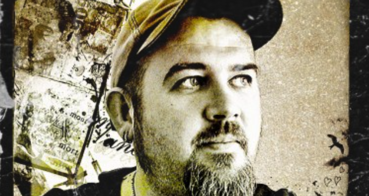
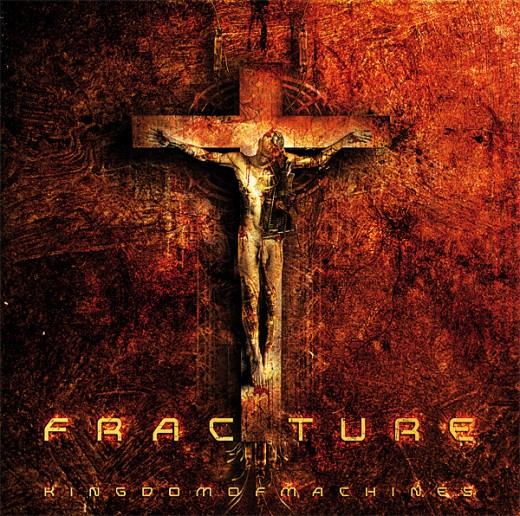
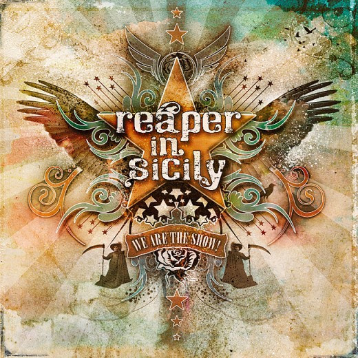
Sam Hayles is an independent art-director and graphic designer currently living in Scotland. He has been designing for 15 years and worked as a freelance designer since 2005 under the name ‘DOSE-productions‘ (DOSEprod). A lot of his works are music and art related, (working with musicians, bands and artists he can relate to). His core output is usually graphic design, illustration and motion design for CD/DVD digipaks, websites, videos, logos, custom t-shirts printed in LA, etc. Though he was born in England, he has spent the majority of his life – so far – in France. It was only in last year that he has moved to live and work in Edinburgh, Scotland. With it being such a culture shift, he says he’s already finding it quite inspiring being in such a wonderful city. He will share to us very sound advice and tips based from his 15+ years experience in design. He says that any aspiring designer should have intense passion about design in order for him to make it big- he should be 100% determined such that he’s willing to work hard and forget about social life for a couple of years just to create a solid portfolio. How did you get into design? For as long as I can remember, I’ve always drawn sketches and created some form of art. I have always been interested in music and film and I’d spend hours looking at LP vinyl artwork and movie posters. Movies were – and still are – a big influence in my work and I’d always try to figure out how they created the special effects with set design, matte paintings and all the other cool photography tricks. I’ve had no formal training. Everything I know is self-taught from years of reading design books, experimenting and software tutorials. I developed a fascination with typography and collage and even now these are the strong qualities that come out in my work. I did try schooling years later and put myself on a 3-year Visual Communication course at the Surrey Institute of Art and Design, but only lasted a year because it wasn’t as exciting as the things I already knew and loved. That and my tutor hated Neville Brody and David Carson. Things were never going to work out…
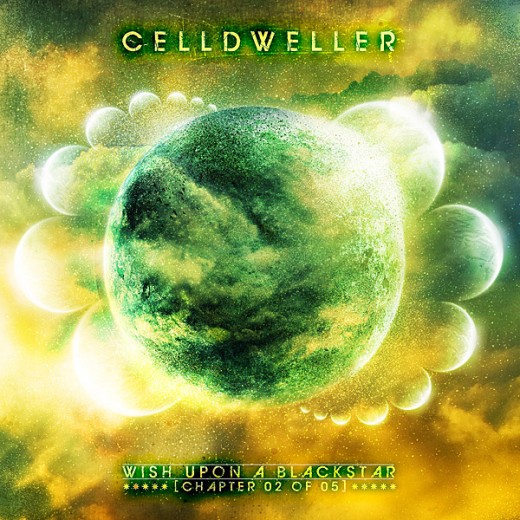
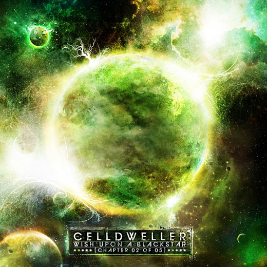
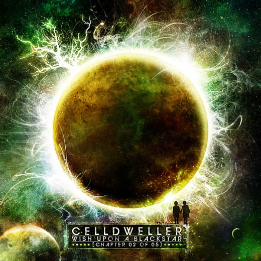
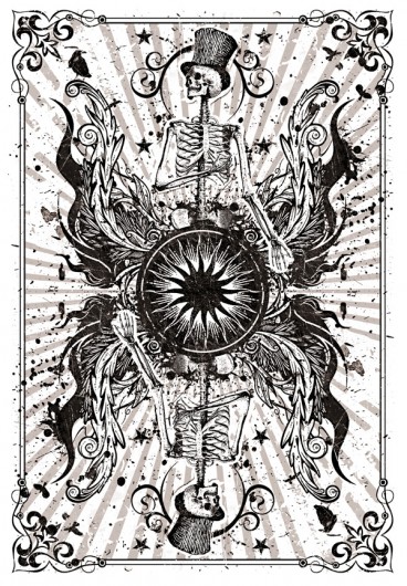
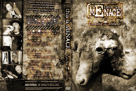
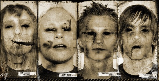
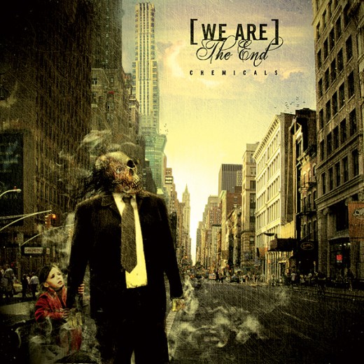
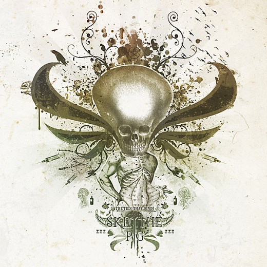
What and who are your influences? Like I say, a lot of my work is influenced by music. It could be the band themselves and the actual music or maybe just a song title or lyric…and not just the artist I’m working with. I’ve amassed a pretty eclectic record collection over the years and I’ve no doubt plays a part in my visual world. I regularly take time to watch films too. A lot of emotional depth and feeling in my art can be traced back to science-fiction and horror films. In general though it can be anything from street art to pop art, punk and D.I.Y. styles, devils, skulls, zombies, robots, spaceships, death, life… y’know, normal things like that. When it comes to “Who?”, I’d say: Dave McKean, David Carson, Neville Brody, Vaughan Oliver, David Lynch, J.P. Witkin, Mark Ryden, Banksy, Chris Cunningham, The Designers Republic, HR Giger, Tim Burton, Dali… the list goes on. Do you have a certain style that you’re known for? I think these days people do know my style and what they’re getting into when they approach me about a project. I do love grunge textures, rust, old paper, sepia tones, anything that looks old, destroyed, burnt. Like it has a history. And I could be accused of using skulls, skeletons and gas masks a lot in my work. Can you blame me? How do you usually work on a concept? Could you tell us the usual process? Most projects start with a discussion with the client about ideas and concepts. We try to pin down some keywords, outside influences and maybe work they’ve already seen and then I leave it for a day or two to give myself a chance to think it over. This is time to consider how I might approach the brief and what I’ll need to make it happen. Then I’ll begin gathering elements like photography, quick sketches, textures etc. and look through any stock imagery I’ve stored away that might be appropriate. I usually start amalgamating found elements already; testing out combinations, discovering what works and seeing if anything jumps out at me. Whether it’s for a specific project or not, I take a lot of photos. I usually have my camera at hand wherever I go to capture things like natural textures, urban environments or even people. With everything out in front of me, I start the actual design. Like with all creative work, even with all the prep work the results can still be quite unpredictable. Sometimes a design can be close to complete within a day, but other times it can take weeks. I’m not afraid of happy accidents either. Some errors or glitches sometimes supersede my original ideas and take the project on a whole new direction. With everything I do I tend to leave it to “rest” so I can view it with fresh eyes another day. What was the worst experience you had with designing CD covers? It’s not that I’ve had one particularly bad experience, but it is really frustrating working with people who believe they know more about design/layout/typography than I do. I am not saying or suggest that they have no idea, but I have been doing this for quite a while now. Some clients fail to take any advice on board and forever ask for something to be tweaked or modified. With enough changes they’ll be convinced that the design has been made better because they’ve had their input, when really you’re left with a confused mess. Could you feature one work and tell us how you did it? Here are several proposals,changes and the evolution made on the artwork for Celldweller – Wish Upon A Blackstar – Chapter 02. All done using photoshop, scans of watercolor and paint splattering.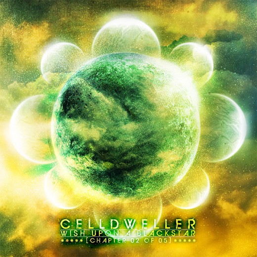
 I will ask you questions that we ask all our designers. To you, what makes a good CD package?
I say anything unusual or experimental. A good CD package should try to push the envelope a little. It’s difficult to reinvent the wheel, but it is nice if someone is willing to take a bit of a risk. Also, I think it’s good if the design is more than just the cover itself. I enjoy blending the design style throughout the whole product, (cover, inlay, the CD itself) to make it feel like a complete package, as if the design tells a story.
What makes a bad CD package?
A design that looks like it’s had little thought gone into it. So many bands and artists fall back on clichés like stock photography or a group shot of the band. That’s just boring to me.
What advise can you give to those who want to get into this kind of career?
You’ll need to believe in yourself, have a lot of patience, work on creating your own style, and be prepared to work hard and forget about social life for a couple of years. I’ve seen many people over the years decide in a day to take up this kind of work because they figured out where the filters in Photoshop are. But it doesn’t take long for them to realize that it’s not that simple.
I’ve been into design for about 15 years and freelancing professionally for 5, but it’s only in the last couple of years that I’ve been able to make a good living from it. It takes a long time to build a solid portfolio and substantial client base. Before you’re calling the shots you’ll need to be prepared to work a lot for little in return – and go that extra mile. Also, more and more, you’ll have to keep track of the evolution of the technologies you use and the new formats that are introduced every year. You need to be more than just an illustrator these days. You have to add a lot more strings to your bow, (whether it’s coding for web design, photography for stills and video or disciplines in animation and motion design).
If you hope to focus your design on particular subjects you have to really ingratiate yourself into that world. It has to be less of a job and more of a passion. There are loads of other jobs that’ll pay way more, but there’s a good chance you won’t be having as much fun. I’m happy to making less because I enjoy what I do so much. Oh and being your own boss is pretty nice too.
_______________________________________________________________________ Unified Manufacturing is an L.A. -based one-stop-shop that offers very affordable CD/DVD/USB replication, custom printing, promotional products, warehousing and fulfillment and many more. If you need an Instant Quote on a project and you want FREE SHIPPING, simply CLICK HERE.]]>




Good article about a great designer. Most articles I’ve read about Doseprod are too short to be of any use or interest. You’ve given the time and the space for his ideas to come out clearly.
Hello ! if you like my artwork check this out :
DOSEprodPACK#01 Available now !
> 5 postcards printed on sleek, glossy stock.
> 6 mini-stickers
> 1 sticker 7x7cm
> 1 badge
> 1 A4 Poster ‘Why Not’ (signed on the back)
> 1 CD – Lastwind / EP ‘Monster trucks’ (Artwork by DOSEprod)
> Several ‘guest’ stickers (bands, artists, designers, illustrators, etc..)
http://www.dose-productions.com/doseprodpack01.php
CHEERS