I have this fascination for creative DVD packaging and lately I’ve been collecting some. It’s just like Pringles, once you pop you cannot stop…collecting.
I bought a DVD last week mainly because of its kick-ass DVD packaging. I didn’t even bother to watch the movie but the cool packaging almost convinced me to watch it.
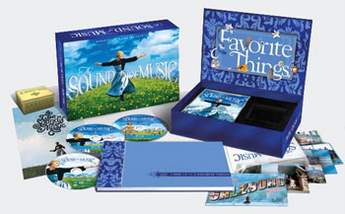
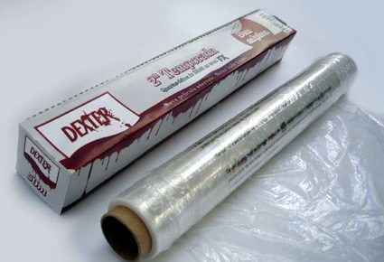
I already have DVDs with t-shirt packaging and some cool sci-fi box sets with collectibles (they’re not cheap), and some other fancy DVD packaging. My collection is growing and my DVD shelf is looking great. In fact, it has lately become one of the main attractions of our house-guests go to the TV room and they inspect the DVDs. Now that’s advantageous because there’s instant topic for conversation.
Last night, I studied my collection once again and, out of boredom, tried to come up with a list of things that I want in a DVD packaging. What do I see in these DVDs that I decided to buy them in a nicer packaging? I am not an expert but this might help you if you are into graphic design or if you are a DVD packaging collector like me.
I am attracted to DVD packaging artwork with a big subject
A big face, a big hand trying to come out of the DVD packaging, a big tree, a big anything. I realized that the DVD packaging I consider attractive are those that do not have too much clutter and are focused on one subject. There has to be a main focus that comprises at least 60-70 percent of the whole frame so that it grabs our eyes.
I want a DVD packaging that is made of thick cardboard paper
Thin paper makes the DVD packaging look cheap and unattractive, don’t you think? It’s as if the manufacturers ran out of money so they chose less expensive materials. A thick paper or cardboard exudes class and sophistication and people’s eyes can distinguish the good ones even from afar.
I want a DVD packaging artwork that’s intriguing but classy
here are some DVD packaging artworks that try too hard to catch our attention that they become scandalous. A big don’t for me. But then again, maybe it’s just me..maybe it’s the best way to sell the movie? All I am saying is that, if you are a DVD packaging designer and you think there’s a way to be catchy without being tacky, then choose that road. DVD packaging should be a work of art not a tabloid.
I want the DVD packaging artwork to be a glimpse of what’s inside
But of course, right? There are DVD packaging that when you take a look at the artwork (the font, copy, etc), it gives you an idea of the mood of the film. It doesn’t have to tell the story, but it should covey the mood, feel, and texture of the whole film in a snapshot.
What about you? What do you want to see in a DVD packaging?
_____________________________________________________________________
Unified Manufacturing is an L.A. -based one-stop-shop that offers very affordable CD/DVD/USB replication, custom printing, promotional products, warehousing and fulfillment and many more. If you need an Instant Quote on a project and you want FREE SHIPPING, simply CLICK HERE.


