Designing the CD artwork of your album might seem easy but if you want to save a few dollars, you have to
It’s easy to design a kick-ass artwork when you have big bucks to blow. You can use whatever material you want, you can hire the most sophisticated art director in town, you can add whatever items you like. In other words, you have more freedom with your designs.
But, this doesn’t happen even to the richest musician because CD=business and business=math and sensibility. Why would you blow big bucks when you don’t have to? Any sane person would go for the cheaper way of doing things as long as it won’t compromise quality and the time frame.
If you have a tight budget yet you still want your CD to look attractive, here are some ways to do it:
Limit the number of pages. If you’re planning to have a booklet, as in the ones inserted in a standard jewel case, try to limit the number of pages. Just include the very essential information. Putting the bio of each band member may not be that necessary especially if you already have a website. Putting the lyrics may not be that necessary as well- in fact, that’s so nineties. As long as it will not cripple the creativity of the whole package, don’t put it there.
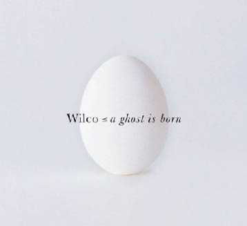
Use Light Colors. Using light colors is much cheaper than using dark colors because dark colors require more ink. Just take a look at this Wilco CD artwork. It still looks good, doesn’t it?

Don’t rush it. You do not want to spend more dollars on Rush Fees. So either you start early on your CD artwork or move your CD release date.
Let an expert design your artwork. Or if you are lucky, you can just ask the advice of experts (if you know some people who won’t charge you for consultation) and design it yourself. Just make sure you know the basics (required DPI, templates,etc) or else you would be wasting lots of time –and even money. Now if you have no time, resources, or skills to design the artwork, I strongly suggest that you let a CD designer do it. If you can find a student designer who’d do it for free, then that’s great but sometimes it’s much better to just hire someone who’s had enough experience. Also, you cannot demand much from those people who offer to do it for free.
We here at Unified are obsessed with beautiful CD artwork and CD packaging. We’ve been making creative releases since 2008 and lovely packaging has become an obsession of ours. We even have a Pinterest page dedicated to all things media packaging. If you want to make a really badass album with cool CD packaging, get a quote or shoot us an email.
_______________________________________________________
James Hill is a veteran of the music industry. He first worked at Warner Reprise Records then later joined Interscope/ Geffen Records where he managed producers and songwriters and got his first platinum record for Keyshia Cole’s The Way It Is. He is now helping indie artists with branding and manufacturing through his company Unified Manufacturing, a CD/DVD/vinyl and merch company in LA.


