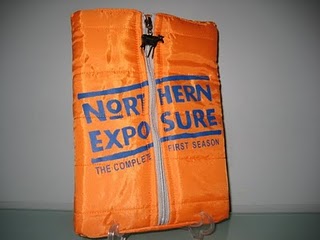
When it comes to advertising, the packaging of the product is as important (in some cases, more important) than the product itself. It’s what lures customers to make the actual purchase. This works both ways. If the packaging is bad, it will affect the product in a very bad way. Sure, there are exceptions to this- mainly to products who are already established good despite their awful packaging (Cetaphil and its boring bottle, for example), but for new products, it could even be the reason why you’re not selling as much as you expected. Long story short, bad packaging could ruin your business. Period.
To ensure you won’t go to the dark side of packaging, here are some examples of really bad packaging designs:
Packaging that are impossible to open

Oh the irony! A packaging opener that’s in a stubborn clamshell. Don’t put your products in packaging that’s hard to open if you care for them. We get it that you want to secure the product but surely there’s a better way than putting it in a clamshell.
Packaging design that’s confusing
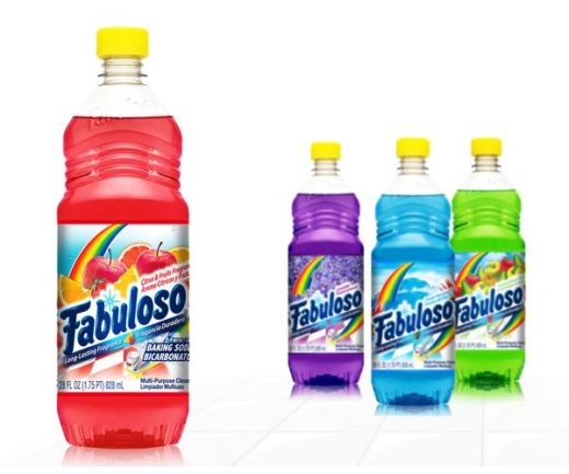
Is this a bottle of concentrated juice drink or a cleaning product?
Confuse one with the other and you get in trouble. It’s great to be unique and creative with your packaging design but make sure you’re not dressing up your product as something totally different. The only way to find out is by showing your designs to as many people as you can to get their feedback.
Packaging that’s wasteful
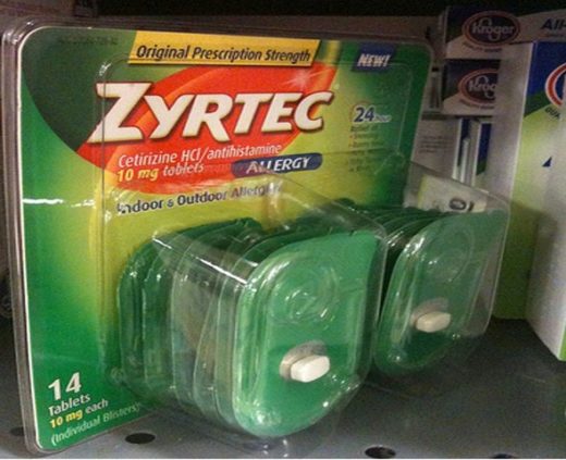
Just take a look at how wasteful this packaging is. We get it that it’s meant to be for travel- bigger packaging per individual pack to ensure the tablets won’t be lost, but this is just too much. If we prioritize convenience as if it’s the main thing you’re selling, then what would happen to the world? There’s a more responsible, sustainable way of packaging products!
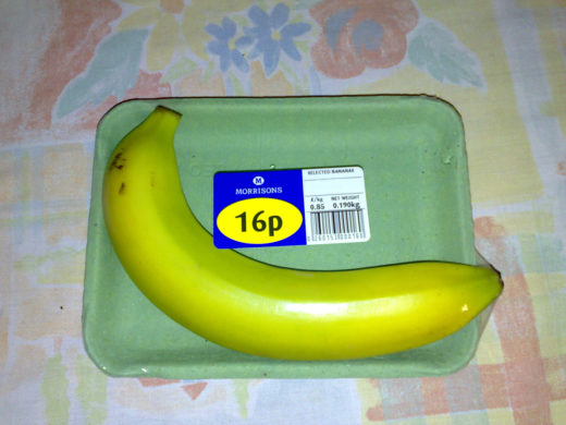
and of course, the notoriously wasteful banana packaging.
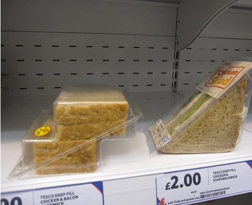
Packaging that’s hard to store, shelf, and understand
The question is…why. Why? No, really, why. Why would you package a sandwich this way? It would be easier for everyone (even to the sandwich) if this was packaged in a straight box instead of one that looks like stairs.
______________________________________________
James Hill is a veteran of the music industry. He first worked at Warner Reprise Records then later joined Interscope/ Geffen Records where he managed producers and songwriters and got his first platinum record for Keyshia Cole’s The Way It Is. He is now helping indie artists with branding and manufacturing through his company Unified Manufacturing, a CD/DVD/vinyl and merch company in LA.

