Bored of seeing the same fonts in album covers? Here are some album artwork with type/letters that are constructed, sculpted, and molded. Alright, I am not a graphic designer so I really cannot tell if some of them are purely manipulated using design software but they surely look like they’re being constructed by hand. 3-D typography is not a new trend but even the albums released decades ago still have spunk and freshness. This style never gets old I guess. Check out some of the best album artwork with 3-D typography.
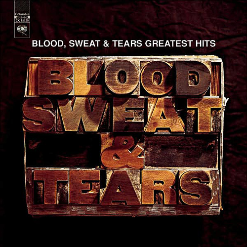
Blood, Sweat, and Tears- The Greatest Hits
We have to forgive them for repeating the band’s name above the wood block because this album was released 38 years ago. It probably is one of the first album artwork with constructed letters and they were confused whether they still have to put the band’s name or not with this kind of artwork.
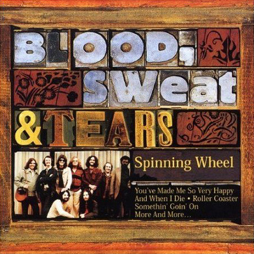
Other BS&T albums that used a similar wood cut type treatment include the “Spinning Wheel” from 1969.
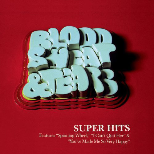
And their “Super Hits” album from 1998.
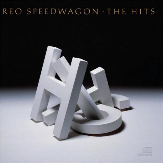
Reo Speedwagon- The Hits
The album cover has the words “HITS” written in the pile of 3-D letters. Although it was created such a long time ago, it still has that fresh appeal.
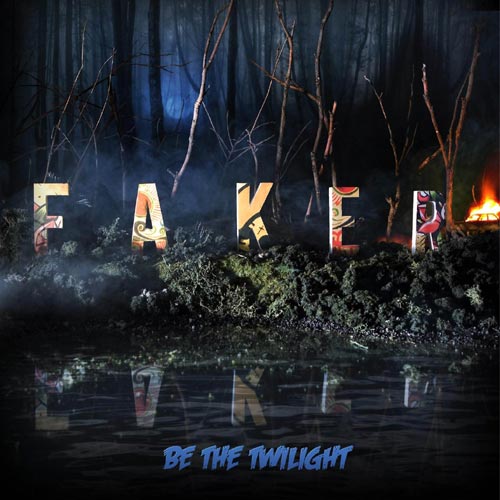
Faker- Be the Twilight
The band’s name standing out in striking contrast and looking a bit like the Hollywood sign. They constructed these letters and the whole diorama. Check out how they created this CD artwork.
P-Money- Everything
This CD artwork took more than 350 hours to complete. It is constructed from styrofoam, balsa wood, coloured paper and cotton wool which were shot as part of a diorama. Check out the making of this artwork.
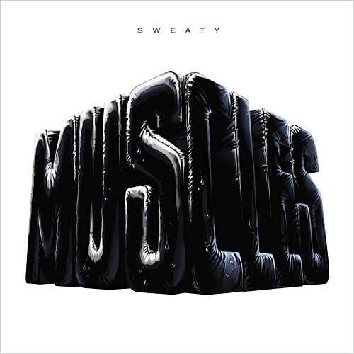
Muscles- Gun Babes Lemonade (Sweaty)
This is one of the singles of Australian band, Muscles. I like its inflated balloon look.
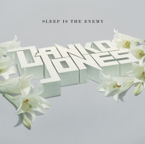
Danko Jones- Sleep is the Enemy
Would you believe this sweet-looking album cover is from a punk rock n roll band?
Chris Lee- Worry No
Cover for Norwegian Hip hop Artist Chris Lee. Also featured in the new book “stereographics” by Victionary. In collaboration with Christian Bielke. Designed by Martin Stousland, Norway.
Special thanks to:
Sleevage
_____________________________________________________________________
James Hill is a veteran of the music industry. He first worked at Warner Reprise Records then later joined Interscope/ Geffen Records where he managed producers and songwriters and got his first platinum record for Keyshia Cole’s The Way It Is. He is now helping indie artists with branding and manufacturing through his company Unified Manufacturing, a CD/DVD/vinyl and merch company in LA.


