The formats and color requirements of the logos and graphics you use on your CD artwork, websites, albums, T-shirts, and posters can vary significantly. As anyone who has tried to do a run of CD covers or has prepared graphic artwork for T-shirts can tell you, you can waste a lot of time adjusting images for each type of use. Here’s a short guide on colors and formats so that you can do it right from the start.
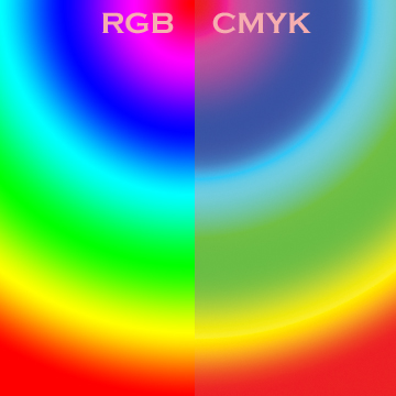
RGB Vs CMYK. First, the colors available on commercial merchandise and CD runs are not the same as those on computer screens. The latter uses a color format called RGB (red/green/blue). This is an additive method, meaning it adds colors from the light source to produce colors. Printed items don’t have a light source like that of a computer screen, so they use a subtractive method called CMYK (cyan/magenta/yellow and black “key”). Unfortunately, there are a limited amount of colors that can be produced with CMYK, even though home printers can approximate RGB colors in printed form. Also, commercial printers for mass production don’t usually use these techniques. When making a CD or T-shirt run, you might look at it on your screen, print it out at home, and think you’re fine. But a graphic artist will begin by converting the images to CMYK, which can result in colors that are jarring. To avoid this, use CMYK colors when creating key graphics such as your logo. To make this easier, if you choose CYMK colors that have a Pantone number, commercial merchandise houses will know exactly which color tones to use, making the conversion much more accurate. FORMAT. In addition to the color scheme, you’ll also need to make format choices. Similar to how recorded music has multiple source tracks that later mix down to stereo, images use a similar concept called layering. Each layer in an advanced graphic image can be added or removed, or even worked on separately from the others, just like an individual track. You’ll want to make each element in your image a different layer to maximize control so you can adjust them later. Some elements are also vectored, meaning that they can be enlarged, shrunk, stretched, or transformed without any loss of quality—similar to a MIDI track that can be transformed, transposed, slowed, or changed without affecting the sound. The layered, vectored formats are the most flexible but usually result in large file sizes. If you work with a graphic artist, always get the “masters” of your images in a format that allows layering (TIFF, AI, PSD) in case you need to adjust your images in the future. Once you’re happy with the images, you will need to do the graphical equivalent of a stereo mixdown: The images become flattened and rasterized. Flattened, rasterized images don’t resize well, but because you’ve eliminated the layers, the file sizes are smaller. These images can be turned into popular compressed formats such as JPG, GIF, and PNG. It’s inflexible formats like these that most musicians send off to commercial merchandise houses and T-shirt manufacturers and expect great results, even if adjustments are needed. This is similar to asking the mastering house to change the volume of the vocals on a track that’s already been mixed down to MP3. Instead, give these manufacturers layered, vectored versions of your logos and graphics so you can get the best product possible. If you know these details before you get started, you’ll save a lot of time and be ready to order and create new merchandise easily.Randy Chertkow and Jason Feehan are the authors of The Indie Band Survival Guide. _______________________________________________________________________ Unified Manufacturing is an L.A. -based one-stop-shop that offers very affordable CD/DVD/USB replication, custom printing, promotional products, warehousing and fulfillment and many more. If you need an Instant Quote on a project and you want FREE SHIPPING, simply CLICK HERE.]]>


