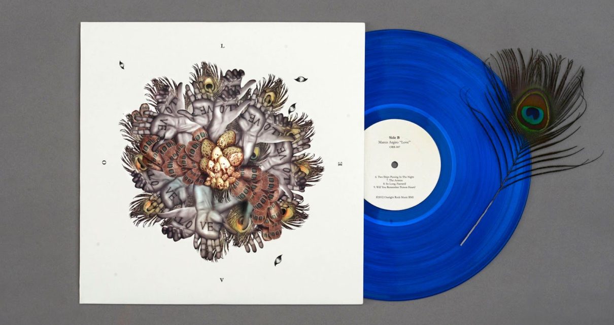
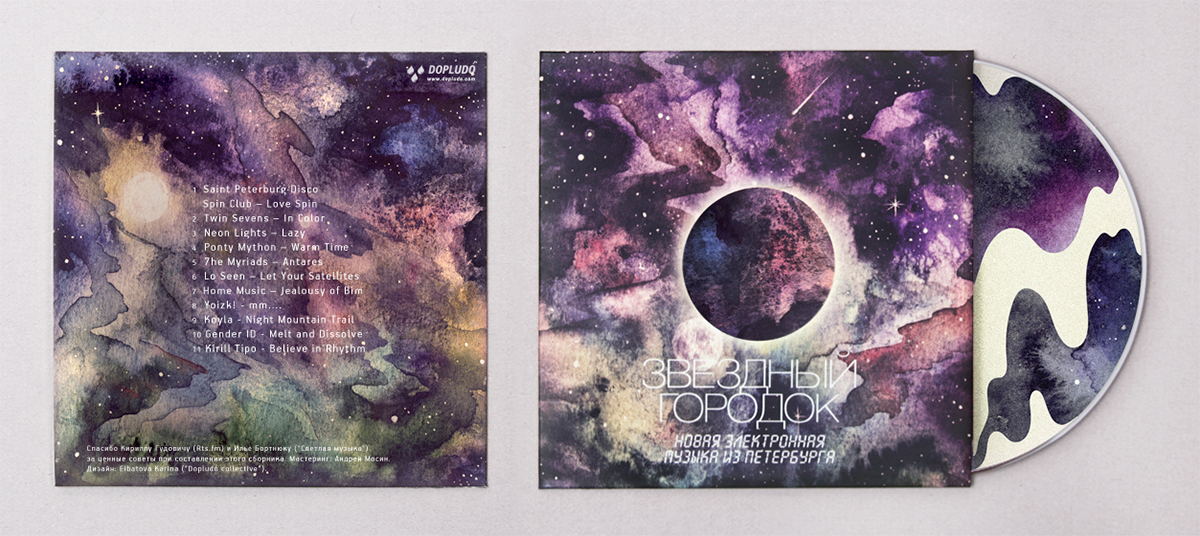
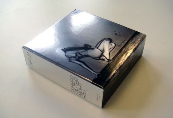
CD packaging has another big role aside from the obvious which is to contain and protect CDs. It could also be a great tool for the musicians to showcase their creativity and their personality. It can be compared to a book’s cover design. Majority of consumers associate good packaging to good music and there are those who buy an album mainly for the cool CD packaging. Therefore and without a doubt, an album with an attractive CD packaging certainly has a great advantage than an album with a regular CD packaging. So you are now convinced that it is necessary to jazz up your CD packaging but you do not want to overdo it because an exaggerated package is simply not you, or you are cautious of the possible additional expenses, or you just don’t want to appear like you’re trying too hard. If you want subtle strategies that could lure customers to your CD packaging, here are some simple ways to add a bit of creativity to your package: Do not use jewel case Instead of using the standard jewel case like everyone else does, use cases less commonly used in the market. The consumers’ eyes are somewhat used to the standard cases and anything new or different is refreshing, thus it makes your album more noticeable and possibly appealing. If you want to go the extra mile, why don’t you customize your case like what this band did? You can make a CD packaging that’s made of cloth if you want to. Anything that’s not inside a CD jewel case instantly has an edge. Use bigger fonts A bigger, clearer font will draw the consumers’ eyes to your album because most albums filled with images and colors so if you have a bigger font, it tends to attract more attention.An album cover that’s mainly comprised of large, block letters may not be too creative but it has a high chance of getting people’s attention. Include small freebies An additional item to your album, no matter how small it may be, will have a big impact to your album’s marketability. The consumers all want to get something more or something for free even if it’s just a pin, a postcard, or a toy. Just make sure your freebies do not appear cheap or desperate for attention. Catchy Artwork I cannot give you solid rules on how to make a catchy image for your album art because I am not a design student. My advice is, first and foremost, try to avoid clichés or overused concepts like solo portraits, band with animals flocking around them, musician holding his guitar, and many others. Check out record stores and observe the most common concepts for album packaging. Then avoid inserting them in your artwork. Another thing to avoid is imitating popular CD packaging unless you want to do a parody. _______________________________________________________________________ Unified Manufacturing is an L.A. -based one-stop-shop that offers very affordable CD/DVD/USB replication, custom printing, promotional products, warehousing and fulfillment and many more. If you need an Instant Quote on a project and you want FREE SHIPPING, simply CLICK HERE.]]>


