You need a band logo if you’re a relatively new, up-and-coming musician and you’ve decided to take your music career to the NEXT LEVEL (good on you). That’s because if you want to push a step further, you have to level up on marketing your band.

That is because being serious with your “music career” means you are willing to market your music to a wider audience.
If you already have a Facebook page or a website, or anything that’s any sort of marketing really, I’m sure you know that one of the first things you have to do is make a band logo. You do not want to just put a photo of you all together playing onstage or even your album art…

I mean, sure it’s decent enough but you want to create a LOGO so it’s easier for them to remember you! You need a band logo for quick recognition.
It also makes you more legit…it sets you apart from those just trying to test a career in music (basically you before this decision to go a notch higher). It give people the impression that you’re in it for the long haul and you’re not like the million other newcomers who will soon change careers and move on.

You need a band logo to give people the impression that you’re in it for the long haul and you’re not like the million other newcomers who will soon change careers and move on. Having a logo means you’re more serious about your music career than those who don’t have any. Next, you can start by having a custom vinyl pressing record in Los Angeles, where Unified Manufacturing professionals are ready to help you and your band.
And anyway, if you don’t have a band logo, what are you going to put on your band t-shirts and merch?
So how do you make a really, really good-looking band logo that can make you feel “this is it”, that it totally represents your band?
SOOO…WHAT MAKES A GOOD LOGO?
Most of these tips are found on David Airey’s blog. He got these important design elements when it comes to brand identities from his friend, Lee Newham. Sharing the list here with my own elaboration because I believe that if yoU nail these three, you got a good logo.
#1. EASY TO DESCRIBE AND RECALL
If people can recognize your logo right away and they can describe it without difficulty, that’s an indication that your logo is good. Most logos that are easy to recall have very simple designs. Think of really famous logos and notice how simple they actually are- McDonalds, National Geographic, Nike. That’s because when it comes to logo design, less is definitely more.
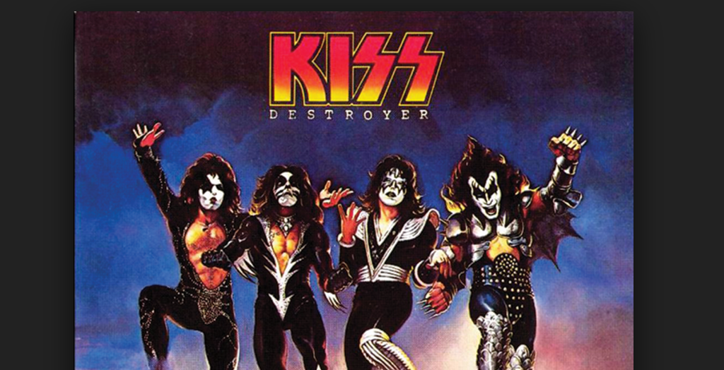
You might think more is more, but take a look at the logos of famous bands.
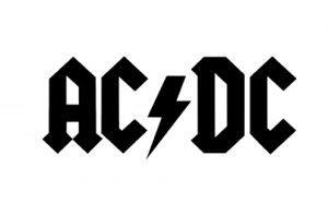
White background for easy printing, just letters and a lightning. The lightning/ electric flash doesn’t even have three slashes, it only has two. But we all know what it represents. Why do three when two is enough?
And just to prove a point…how about we check the logo of the most famous band ever?
The simplicity is outstanding but it’s something we all recognize. Considering the Beatles can practically go crazy, they have an unlimited budget, they can hire the best art directors and marketers, but they came up with just this “simple” logo.
LESS IS MORE.
#2 EFFECTIVE WITHOUT COLOR

Is your logo appealing to the colorblind? Is your logo still effective if it’s in a Black and White paper? If the other elements of your design look too bland or unrecognizable without the colors, scrap it. FORM AND SHAPE SHOULD BE GIVEN MORE IMPORTANCE THAN COLOR. Focus on the two first before you even start experimenting with color.
#3 EFFECTIVE EVEN IF IT’S JUST ONE INCH IN SIZE
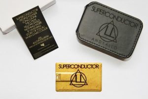
Again, the simpler the better. If you have too many elements going on, the logo would be unrecognizable when scaled down to just an inch. Imagine how busy it would look if you’re going to print your logo on a business card or USB Music Flash Drive.
__________________________________________________________
HOW TO COME UP WITH A GOOD LOGO- in a truly indie fashion
1. Be clear of the image/branding you want.
Identify what you want others to feel upon seeing your logo. List down the words that you want associated with your band. Bright? Funny? Edgy? Write them all down then trim down to five. Be sure that’s what you want your band to be known for. Don’t overlook this step as this is very essential for your branding. The other steps are pointless without this step.
2. View a list of good logo designs.
Study them. Get inspired by them. Try to analyze why they are effective. For a start, here’s Paste Magazine’s compilation of 50 best band logos of all time.
3. View a list of poorly done and ineffective logo designs.
After viewing the good ones, it’s time to check out the awful ones. Try to find out why they’re ugly. Learn from their mistakes. Here’s Gigwise’ list of really awful band logos.
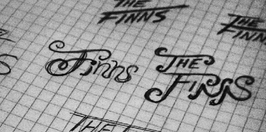
4. Make sketches.
To make you and your designer’s lives easier, sketch the designs you want. It’s pretty tough explaining something visual in words- even the most poetic words can’t beat a decent sketch.
5. Choose the fonts you like.
You may not be an expert of fonts but just so your designer will have an idea of what you like, google the fonts you like. Show it to your designer and ask his opinion. If he’s a good designer, he’d know if it looks good with your design and if it matches your goals. If he doesn’t find them fitting, he can easily look for a font that’s close to what you want.
6. Decide the color palette.
What colors do you think best represent your band and the image you want to portray? Suggest color combinations to your designer and let him make versions.
Tip: Make sure you let a designer and art director make your logo if you know nothing about design. Now we know Nirvana made an iconic “Smiley Face” logo with it’s crossed-out eyes and it’s drooling mouth.
Most people agree it was drawn by Kurt Cobain and made it first appearance on this flyer for the release party for Nirvana’s “Nevermind” album.
Well, you see… THEY’RE NIRVANA. You can take that risk or work side-by-side with those who have experience in what works. It will cost you a few dollars but nothing that could cripple your savings.
Don’t spend too much but don’t DIY either. You’ll be using your logo (hopefully for eternity) and to everything from your band buttons to contracts.
DO IT RIGHT.
Unified Manufacturing offers professional logo design services at an affordable price. We also do CD replication, poster printing, merch manufacturing, and more, making us a one-stop shop for musicians.
______________________________________________________________
James Hill is a veteran of the music industry. He first worked at Warner Reprise Records then later joined Interscope/ Geffen Records where he managed producers and songwriters and got his first platinum record for Keyshia Cole’s The Way It Is. He is now helping indie artists with branding and manufacturing through his company Unified Manufacturing, a CD/DVD/vinyl and merch company in LA.

