 So you’ve been wracking your brains out and squeezing every droplet of creative juice for the most awesome CD packaging ever. It’s not easy but I am sure that it would all be worth it once you see people’s “wow, cool!” expressions when they see your CD packaging. You realized just how important CD packaging is not only in increasing album sales but also in defining your music and you as artists. Because of that, you also realized just how difficult it is to design the CD packaging because it is not simply any piece of art you include in your album; it should somehow reflect who you are as artists. Sounds tough? Well it should be if you want it to be exceptional.
If you are a musician planning for a kick ass CD packaging design, here are some basic Dos and Don’ts that you should bear in mind.
1.)DO make your own packaging if you feel like making art. Yes, you can! Many musicians nowadays make many cool CD packaging designs for their album. It may be because you are broke and you want to save on talent fees, or you want to embrace your indie-ness so you want to make everything on your own, or you just want to show the world that you’re not just musicians-you are visual artists as well! Whatever your reasons are, you are more than free to make your own CD packaging design. Just make sure you know the basics about design and CD packaging and that you have the right software and tools. It is also wise if you consult your friends and relatives who are CD packaging designers.
Don’t expect it to be easy and/or awesome if you are a first-timer. What’s so hard about doing a creative CD packaging? You just need to get cool images together and juxtapose them creatively with your brief bio and your band name, right? Wrong! There are tons of things you need to know about CD packaging-you may even have to read a whole book about it and it’s still not enough- before you can actually start making one.
2.)DO grab attention by using catchy images and artwork. Using a compelling photograph is still one of the tried and tested ways to get the attention of consumers. With the tough competition in the market, there are now literally thousands of ways to produce a really creative CD packaging-from using unique materials to adding freebies-but this one never runs out of style. It is a classic! Do not hesitate to consult CD Packaging designers and photographers about your concept because they know the basic rules of color, composition, and technical requirements to make your image stand out.
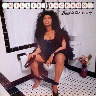
DON’T overdo it by resorting to scandal. There is nothing more desperate than tasteless, trashy, and vulgar CD packaging designs that try too hard to shock and get attention for the sole purpose of getting attention. Album art is not called art for nothing! Its primary purpose is to beautify and express creativity. If a CD packaging caught your eye because it has an explicit or gory image, but once you take a closer look you realized it has nothing more to say, then that is trash. Be kind to your planet and don’t make trash.
3.)DO look for albums with kick-ass packaging for inspiration. If you are running out of ideas for your CD packaging, the best technique is to browse the Internet, record stores, or music magazines for CD packaging designs. Just browsing through albums with creative CD packaging can spark a great idea. Take note of the CD packaging designs that you really like and list down the characteristics that you like about them. This would help you have a more concrete idea of what you want for your CD packaging.
DON’T be too inspired by them that you steal their design. Granted that there are only very few original ideas in the world but when you try to copy a very unique CD packaging design from the inside out, you are doomed my friend! Make sure that when you try to imitate a CD packaging, you make many alterations and include additional features that the intelligent buyer would not recognize your CD packaging as an imitation of a more famous CD packaging.
4.)DO make sure that your band name and album title is readable. Avoid fonts with letters that stick too close to each other so your band name and album title would still be readable from afar. Again, it is best that you consult or work with graphic designers because they know the principles of CD packaging by heart.
5.)DO include freebies. This may cost you a few more dollars but it is definitely worth it. The consumerist human brain is programmed in a way that when he sees a free item, he would instantly think that he’s getting much more than what he paid for. Just make sure that your freebies don’t make your product look cheap. Giving away grocery coupons, for example, would make your album look like it’s not selling much that’s why you resorted to giving free grocery items. Choose cool items like keychains, stickers, or paper sunglasses.
DON’T include freebies that cost more than the CD. Unless you are a new band willing to lose lots of dollars or you are an established band with superfans willing to spend much for anything you sell, do not spend too much on freebies. T-shirts and plush toys cost almost the same as the actual CD. It is not wise to include these items unless you have sponsors that give them to you for free. Hardcore fans would not mind (and in fact would love) buying your more expensive “product” but the regular buyers would think twice. Only very popular artists like Madonna and Red Hot Chilli Peppers could probably pull this off.
6.)DO enjoy the ride. Conceptualizing the CD packaging is probably one of the most enjoyable parts of the production of your album. Do not be too hard on yourself and just enjoy the process. This is always a do.
_______________________________________________________________________
Unified Manufacturing is an L.A. -based one-stop-shop that offers very affordable CD/DVD/USB replication, custom printing, promotional products, warehousing and fulfillment and many more. If you need an Instant Quote on a project and you want FREE SHIPPING, simply CLICK HERE.]]>


