Designing a media packaging whether it’s a CD/DVD case, USB box, vinyl sleeve, or special box set that contains all of the above and some merch, is equal parts art and science. It has to attract your target market but at the same time, it also has to be able to protect the contents as well as be affordable, easy to store and ship. Whether you’re a pro or a beginner in packaging design, here are some media packaging design secrets that can make your job easier and your output compelling.
DESIGN WITH THE IDENTITY IN MIND
What’s your brand? How do you want people to remember you and your art? What kind of feelings do you want them to feel when they see your product, website, concert…everything? I mean, designing for Katy Perry is totally different from designing for Blink 182. When you choose the colors, the material, and every single thing actually, always ask yourself if it matches the branding.
KNOW YOUR CUSTOMER
If your branding is not too specific or unique, you must at least know your customer. All packaging design is geared to first understanding who you are marketing to. Is this for a particular concert or event? What type of people go there? Do you think it’s better to make a simple and affordable packaging or something really out of this world and expensive? Know your customer.
COLOR IT RIGHT
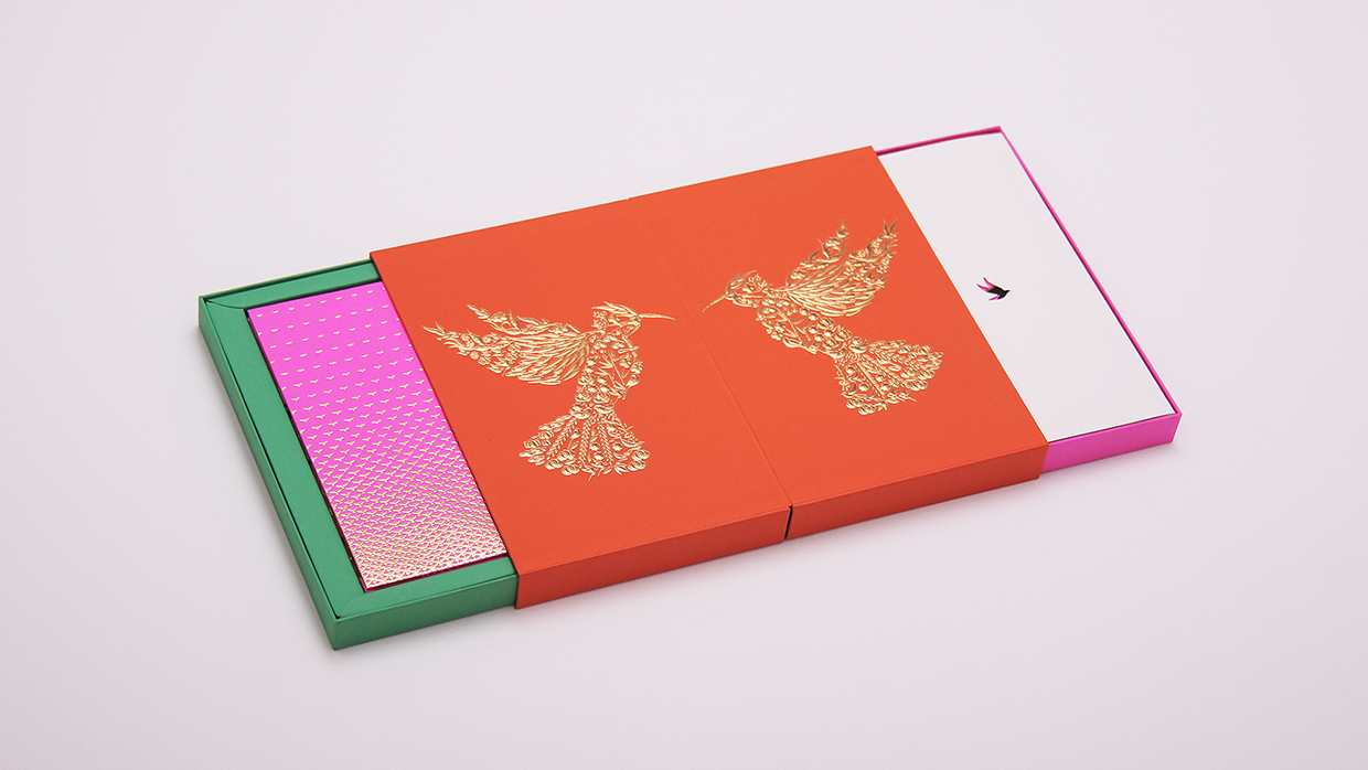
Don’t underestimate the power of color. Simple, bold colour, or unexpected colour combinations all generate different emotions. So don’t hesitate to use colour or finishes (foils or metallic inks) to stand out.
TIP: If many products in your category use bright colours, it’s the perfect opportunity to use a simple coordinated palette.
CHOOSE FONT WISELY
Typography can add emotion to what’s being said so always give careful selection to the fonts used on the package. Like colours, different fonts evoke different moods.
LESS IS MORE
One of the biggest mistakes amateur designers makes is cramming too much information in the design. It won’t make the design better and more effective, it would likely ruin it.
MAKE IT AN EXPERIENCE
Everything is an experience whether it’s a poorly made t-shirt design or a flashy billboard. While conceptualizing your CD packaging, really see it as an experience. What will they feel like when they see the artwork? When they open the case? When they flip through the booklet? This means, it can be beyond beautiful. It can smell great, feel rough, sound squeaky when you flip the pages.
CONSIDER PRACTICALITY
Your package design is beautiful but is it easy to open, transport, store, ship, stack, put on the shelf? These things differentiate art from design. Design has to work. Don’t dismiss your idea though, just make adjustments to make sure you put practicality in the equation.
INVEST IN A GOOD PRINTER (LIKE US)
It’s no use coming up with a really kickass design if you scrimp on printing. It can absolutely ruin your package and if you print 1000s, good luck with your loss. Go for printers who really have a good portfolio and good reviews. Ask recommendations from friends as well. It’s wise to print a few before you order 1000s.
_______________________________________________
Unified Manufacturing is an L.A. -based one-stop-shop that offers very affordable CD/DVD/USB replication, custom printing, promotional products, warehousing and fulfillment and many more. If you need an Instant Quote on a project and you want FREE SHIPPING, simply CLICK HERE.


