Every musician I know that’s serious about his or her career has a CD no matter what the statistics show about the decline of CD sales because they know it’s a big tool for branding. Having a CD is saying “ No, Im not one of them. I am investing in my career because I believe in my talents. Here’s to make it official.” With millions of new bands competing for attention, you have to step out of that sea of newbies by coming up with a CD. It just shows that you’re confident enough with your talent and that you really mean business.
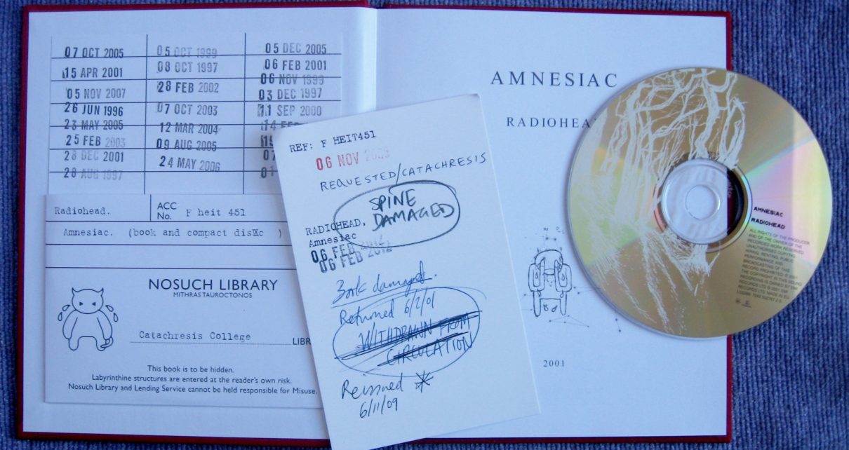
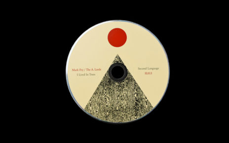
How do you attract people to buy your CD? By having really, really good music (of course!), and by having a kick-ass CD packaging. Artists are becoming more and more innovative and creative with their CD packaging because they now understand that it’s not only meant to package (as in contain) their ‘goods’ but also to build their image or brand.
If the CD is in fact dying, then the best way to save it is by having a kick-ass CD packaging. A creative CD packaging can convince regular fans to buy the real thing instead of illegally downloading stuff on the internet. I have no statistics or proof that the CD packaging really affects sales but the top vinyl sales of the year (2010) all have really attractive packaging. I do not think it would have the same result if they didn’t put much attention to their CD packaging.
So what makes a kick-ass CD packaging? Here are some of my tips…
Avoid clichés. Even the cleverest design becomes dull when we see it hundreds of times. People always want something fresh. There are cases wherein an artwork is an homage or parody of a popular design, well that’s okay…actually some of those could still be very brilliant (and people love collecting them), but what I’m saying here is when a design/concept is already cliché. What are the most common clichés for album artwork? Hmm…off the top of my head, musicians behind a brick wall, Hip-hop artists with lots of bling riding a cool bike, couch photos. Totally forgettable, right? If you’re going to have a cliché cover, don’t expect people to TALK about it. Don’t expect people to pay attention to it.
Go to your nearest record store and look for the most overused concepts. Or, you can just Google CD artworks and list down the ones that get your attention and the ones that are boring. Brainstorm with your designer. He has a keener eye to these things.
Appeal to other senses.I know artwork should be visual because the best way to attract attention is by appealing to the sense of sight. Make your artwork LOOK stunning and people won’t miss your CD packaging.
But if you want more attention and if you want your fans to feel like they’ve got their money’s worth, then do what Katy Perry did to her latest album “Teenage Dreams” .
Her artwork is about candies and other sweet things so they made the paper smell like cotton candy! You can smell a faint smell of cotton candy when you flip the pages of her booklet.
Now, what about for the sense of touch? Add texture or add softness perhaps. If you have an album artwork that looks yucky, you might want to make the packaging feel ‘yucky’, too. Be creative. It will pay off, I promise! Maybe not financially, but it will have good pay-off to your career.
Include free items. Everybody loves free items! Even if I become filthy rich, I think I’d still love the word FREE. You do not have to spend thousand or hundreds-in fact, you don’t have to spend a cent at all. Just come up with a good idea. Think of items that you already have right now that you think your fans would love.
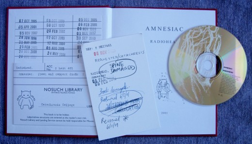
Pair with a hardbound book. Coffee table book, your band’s bio, a set of poems, what have you. You can bundle your CD with a hardbound book for the super fans. Make sure you already have super fans before you produce thousands. In fact, do not manufacture thousands when you are not yet as famous or as rich as Madonna. Just make a few copies (say a hundred?) and mark it as “limited edition” book.
If you are scared to lose bg bucks, then try offering this to your website and let fans pre-order. You can also try posting a project in Kickstarter. It is a website where artists like you can post their projects and ask for funds. I’ve seen lots of musicians that receive funds for their music videos, CDs, etc. It’s a good place to offer ‘pre-orders”.
I bet you’re now too excited to brainstorm with your team! Do not worry too much about the financial returns as of now. A creative CD packaging serves as a good investment for your long-term goals. Build your brand/image now and you’ll likely reap your financial rewards in the future. Good luck and enjoy getting creative!
We here at Unified are obsessed with beautiful CD packaging. We’ve been making creative releases since 2008 and lovely packaging has become an obsession of ours. We even have a Pinterest page dedicated to all things media packaging. If you want to make a really badass album with cool CD packaging, get a quote or shoot us an email.
_______________________________________________________________________
James Hill is a veteran of the music industry. He first worked at Warner Reprise Records then later joined Interscope/ Geffen Records where he managed producers and songwriters and got his first platinum record for Keyshia Cole’s The Way It Is. He is now helping indie artists with branding and manufacturing through his company Unified Manufacturing, a CD/DVD/vinyl and merch company in LA.

